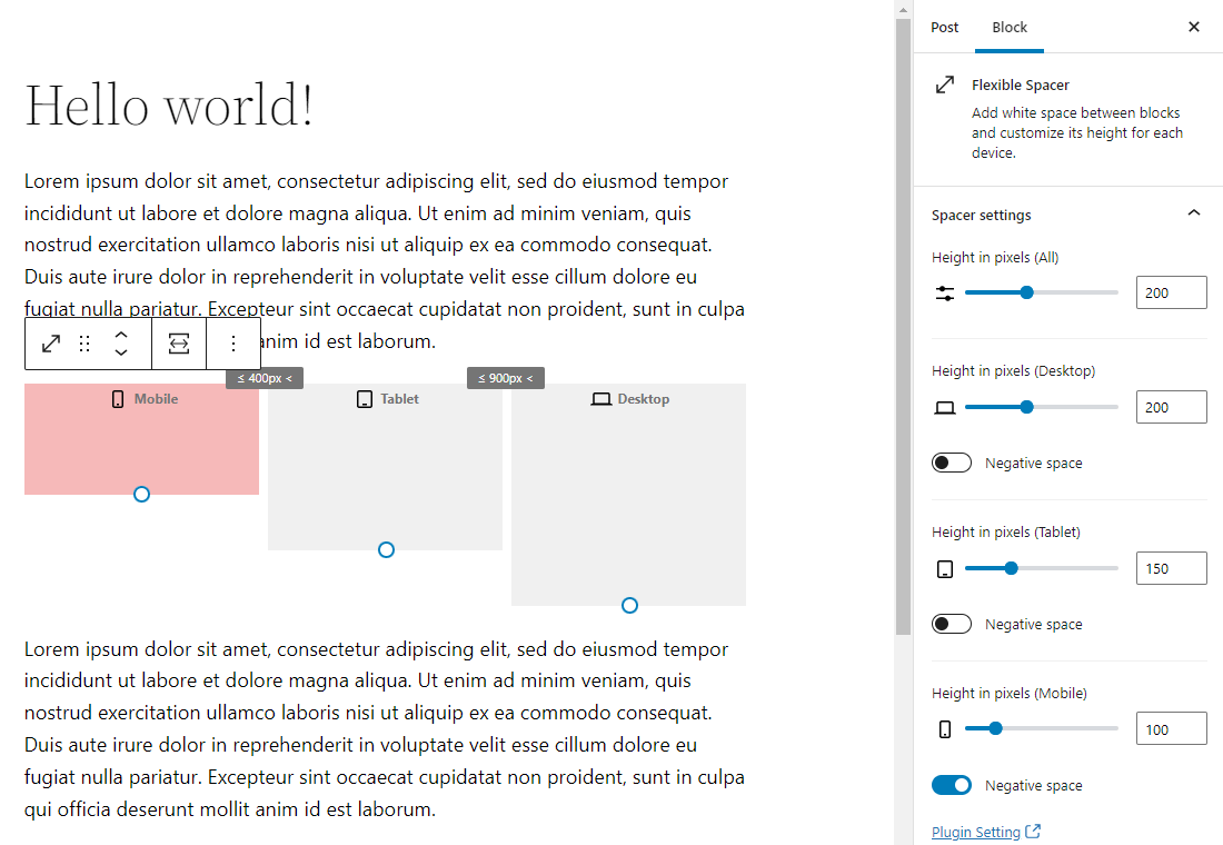
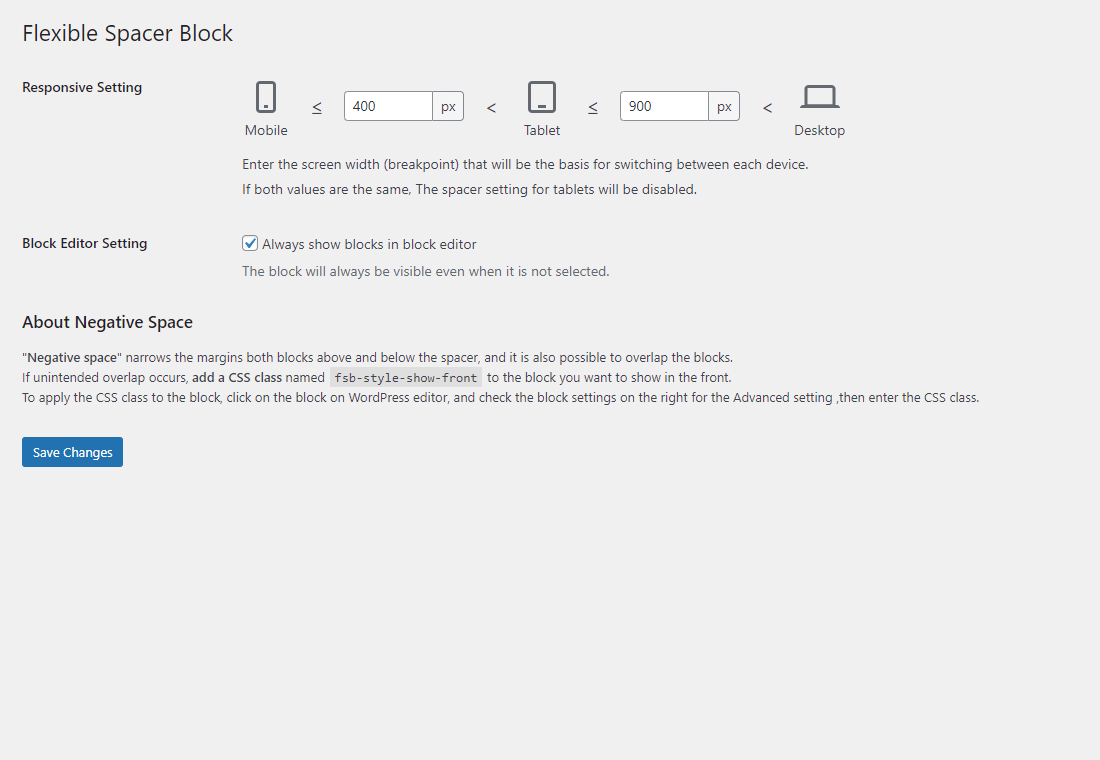
Flexible Spacer Block switches the height of the spacer according to the device screen width (breakpoints). This block has two variable breakpoints, and you can adjust the height of the spacer for smartphones, tablets, and desktops respectively. The height of the spacers can be changed individually or in batches. Also available to set "negative space (negative margin)" instead of the normal space. And this block supports transform from and to core spacer block.
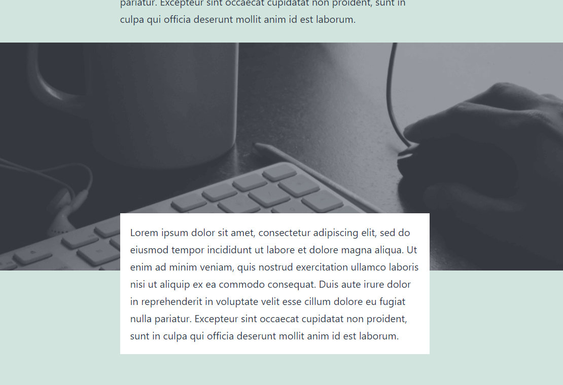
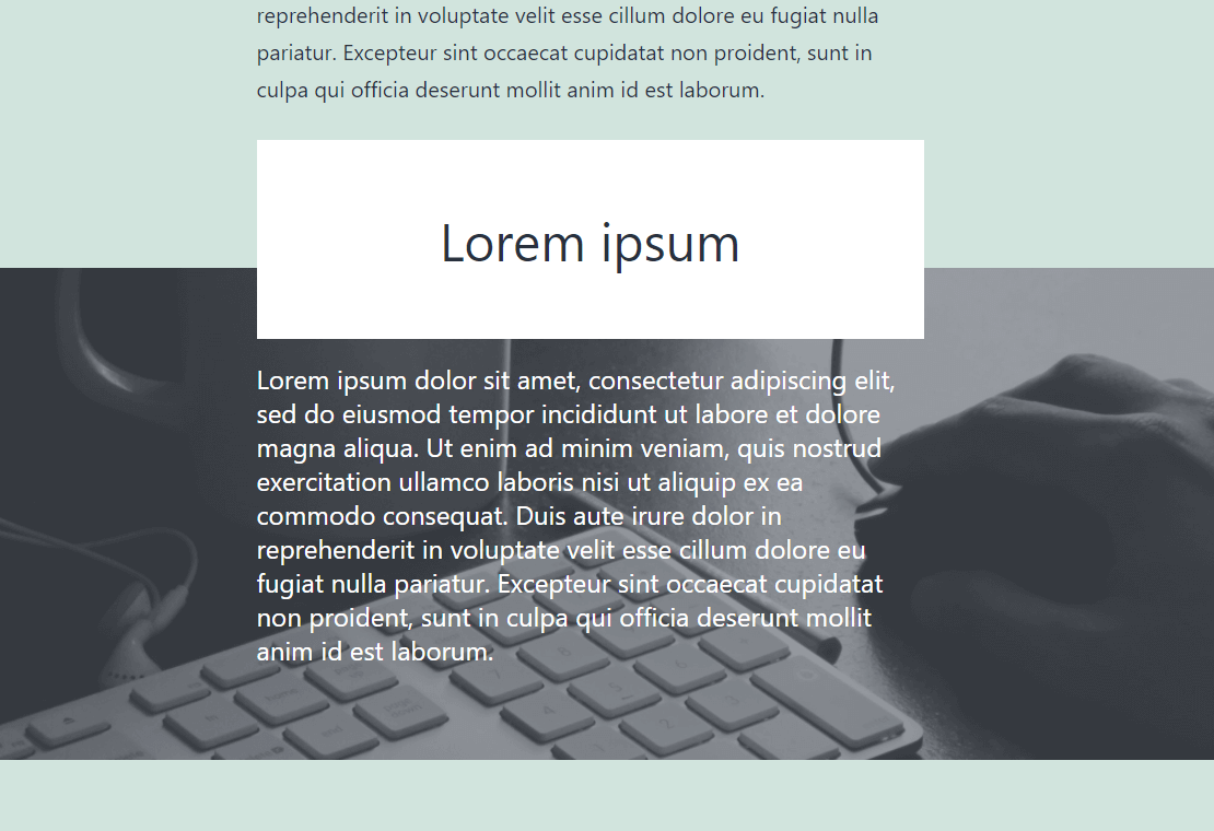
"Negative space" narrows the margins both blocks above and below the spacer, and it is also possible to overlap the blocks. If unintended overlap occurs, add a CSS class named "fsb-style-show-front" to the block you want to show in the front. To apply the CSS class to the block, click on the block on WordPress editor, and check the block settings on the right for the Advanced setting ,then enter the CSS class.
npm install
npm run build
Filters media query breakpoints.
$breakpoint
(array) media query breakpoints ( md / sm ).
$is_editor
(bool) Whether it is rendered on the editor.
(array) New media query breakpoints.
function custom_flexible_spacer_block_breakpoint( $breakpoint, $is_editor ) {
	// Override media query breakpoints.
	return array(
		'md' => 1000,
		'sm' => 500,
	);
}
add_filter( 'flexible_spacer_block_breakpoint', 'custom_flexible_spacer_block_breakpoint', 10, 2 );Filters Generated inline styles.
$css
(string) Generated inline styles.
$is_editor
(bool) Whether it is rendered on the editor.
(string) New inline styles.
function custom_flexible_spacer_block_inline_css( $css, $is_editor ) {
	// Override z-index value for negative space on the front-end.
	if ( ! $is_editor ) {
		return str_replace( 'z-index:2;', 'z-index:5;', $css );
	}
	return $css;
}
add_filter( 'flexible_spacer_block_inline_css', 'custom_flexible_spacer_block_inline_css', 10, 2 );- License: CC0 Public Domain
- Source: https://pxhere.com/ja/photo/245


