Friendly onboarding wizard for Plasma
Welcome Center is the perfect introduction to KDE Plasma! It can help you learn how to connect to the internet, install apps, customize the system, and more!
There are five mutually exclusive usage modes:
- Run the app normally and it will show a welcome/onboarding wizard.
- Run the app with the
--pagesargument to show specific pages (e.g.KDEConnect,Vaults.qml,01-NateOS) - Run the app with the
--post-updateargument to show a post-update message. - Run the app with the
--post-update-betaargument to show a post-update message for beta releases. - Run the app with the
--live-environmentargument to show a reduced wizard with the live installer page and no settings pages.
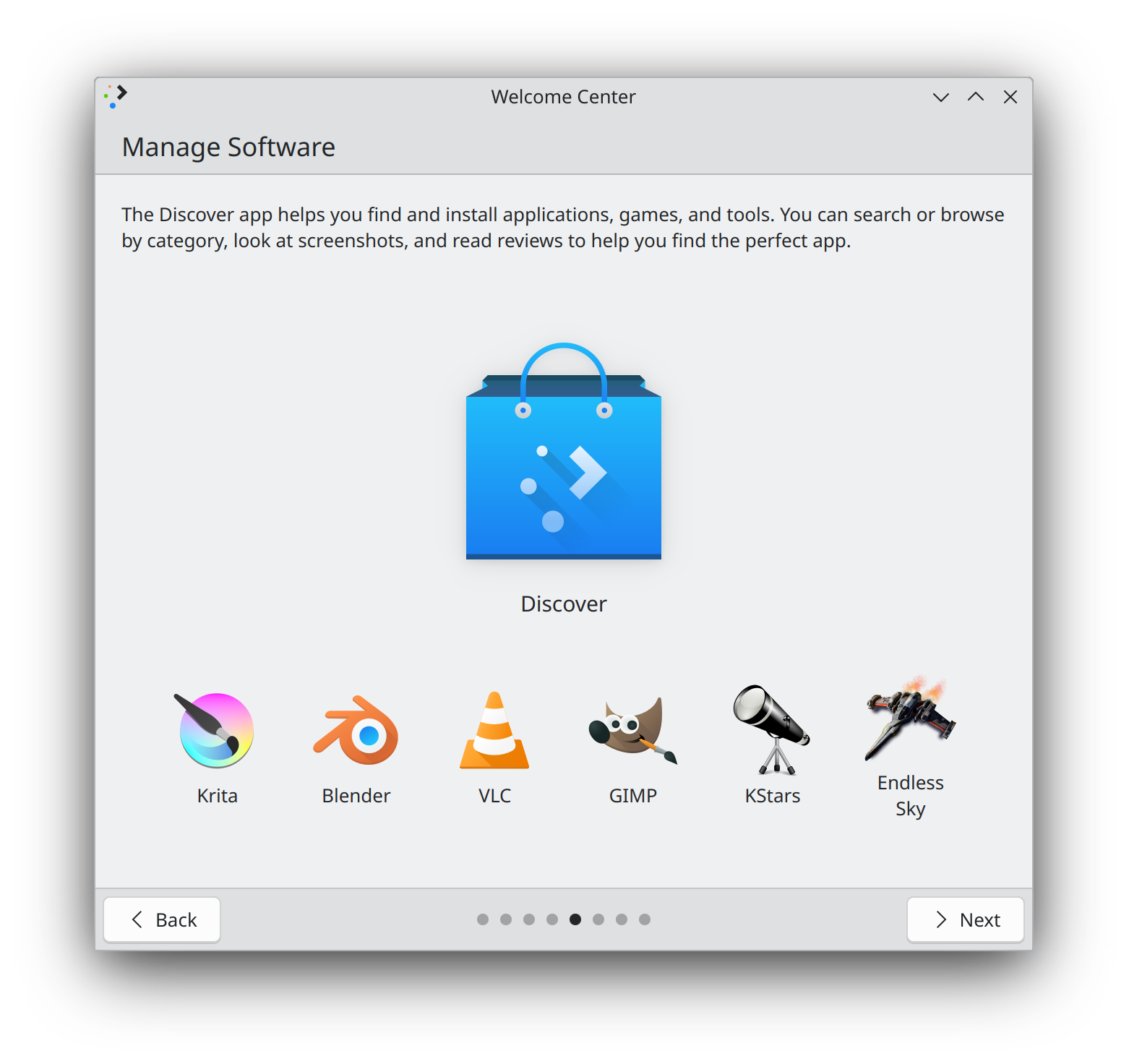
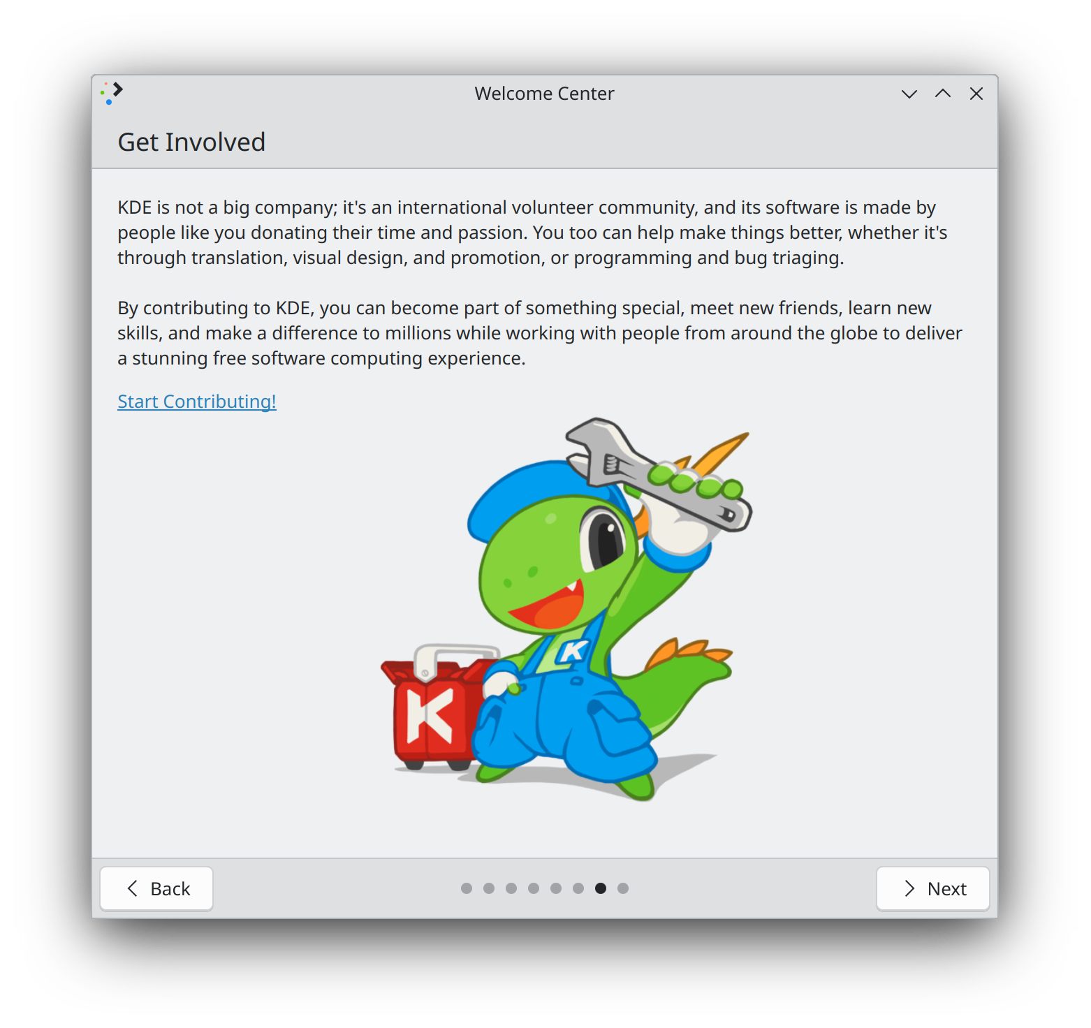
| Welcome to KDE Plasma! | Managing Software | Getting Involved |
|---|---|---|
 |
 |
 |
When Welcome Center is ran in a live environment, it can show a reduced wizard with a page welcoming the user to the disibution and without any settings pages.
To ensure that Welcome Center's launcher recognizes the live environment, you will need to create/change the config in your live user's ~/.config/plasma-welcomerc:
[General]
LiveEnvironment=true
LiveInstaller=calamares
LiveInstaller is optional, used to show a shortcut to launch the installer. It should be the name of a desktop file in /usr/share/applications, without the .desktop extension.
By default, the first page introduces the distro and mostly talks about Plasma and KDE. If desired, this can be changed by placing a specially crafted desktop file at /usr/share/plasma/plasma-welcome/intro-customization.desktop. In this file, you can supply custom intro text, which will be displayed first, before the standard text talking about Plasma and KDE. It is recommended to keep this text short.
In addition, you can optionally specify a custom icon or image to replace the Konqi image, a custom caption for it, and a custom URL to open when clicking on it. Text can be localized in the standard way that text in desktop files is localized. Note that you are expected to do this yourself!
[Desktop Entry]
# Required since this is a Desktop file; ignored
Type=Application

# Required; becomes the first paragraph on the Welcome page
# Don't forget to offer translations of the text!
Name=Welcome to NateOS! It's the best OS ever, until it explodes. Did you know that's a feature? It's right there on the box!
Name[fr]=Bienvenue sur NateOS! C'est le meilleur système d'exploitation du monde, justqu'à qu'il esplose. Saviez-vous que c'est intentionnel? C'est écrit sur la boîte!

# Optional; replaces the default image on the Welcome page
# can be an icon name or an absolute path to an image on disk beginning with file:/
Icon=edit-bomb

# Optional; replaces the default image caption on the Welcome page
# Don't forget to offer translations of the text!
Comment=This is what a bomb looks like. Don't worry, you'll become very familiar with them!
Comment[fr]=Voici à quoi ressemble une bombe. Ne vous inquiétez pas, vous allez vous familiariser avec elles!

# Optional; replaces the default URL opened when clicking on the Welcome page's image or icon
URL=https://www.youtube.com/watch?v=dQw4w9WgXcQ
Translations can be tested by manually running Welcome Center in a different language, e.g. LANG=fr_FR plasma-welcome.
Custom distro-specific pages can be embedded in the app, and will appear right before the "Get Involved" page. Only content that is safely skippable should be added, since the user can close the app at any time, potentially before they see your custom pages.
To make custom pages visible to the app, place them in /usr/share/plasma/plasma-welcome/extra-pages/, prefixed with a number and a dash. For example if you define two pages with the following names:
01-WelcomeToDistro.qml02-InstallMediaCodecs.qml
These two pages will be added into the wizard, with WelcomeToDistro shown first, and then InstallMediaCodecs.
Custom pages are QML files with a root item that inherit from Kirigami.Page. Any content within the page is supported, though to maintain visual consistency with existing pages, it is recommended to use GenericPage, ScrollablePage or KCMPage as the root item and set the heading and description properties, with any custom content going beneath them. You can reference existing pages when creating your own.
Because pages are written in QML without support for C++ support code, only functions that can be performed entirely with QML are available. If you have a specific use case that can't be supported with these tools, please file a bug report detailing it.
Here are some examples of the behavior that can be implemented in custom pages:
Kirigami.Icon {
    source: "media-default-track"
    HoverHandler {
        cursorShape: Qt.PointingHandCursor
    }
    TapHandler {
        onTapped: Qt.openUrlExternally("https://www.youtube.com/watch?v=dQw4w9WgXcQ")
    }
}
ApplicationIcon {
    anchors.centerIn: parent
    application: "org.kde.dolphin"
    size: Kirigami.Units.gridUnit * 10
}
Controller.runCommand() allows you to run a terminal command. If you need to check the exit status of the command or get text output from it, then use the version that takes callback function, and implement it as needed for handling the success and failure cases.
Kirigami.Icon {
    source: "notification"
    HoverHandler {
        cursorShape: Qt.PointingHandCursor
    }
    TapHandler {
        onTapped: Controller.runCommand("notify-send foo bar")
    }
}
Kirigami.Icon {
    source: "input-touchscreen"
    HoverHandler {
        cursorShape: Qt.PointingHandCursor
    }
    TapHandler {
        onTapped: Controller.runCommand("touch /location/that/doesnt/exist", callback)
        property var callback: (returnStatus, outputText) => {
            if (returnStatus == 0) {
                showPassiveNotification(i18n("Um, that wasn't supposed to work. Your distro must be very special."));
                status.text = i18nc("@info:status", Last command invocation succeeded);
            } else if (returnStatus == -1) {
                showPassiveNotification(i18n("`touch` not found; can't touch anything"));
                status.text = i18nc("@info:status", Last command invocation failed because the command was not found);
            } else {
                showPassiveNotification(outputText);
                status.text = i18nc("@info:status", Last command invocation failed);
            }
        }
    }
}

QQC2.Label {
    id: status
}
KCMPage {
    heading: i18nc("@title: window", "Learn about Activities")
    description: i18nc("@info:usagetip", "Activities can be used to separate high-level projects or tasks so you can focus on one at a time. You can set them up in System Settings, and also right here.")

    path: "kcm_activities"
}
To show a layer in your page, create a component for the layer's page and push push it with pageStack.layers.push(layerComponentId). You should consider whether a Kirigami.OverlaySheet might be more appropriate.
GenericPage {
    heading: i18nc("@title:window", "Show a layer")
    description: i18nc("@info:usagetip", "This page can show a layer by pressing the action button in the header.")

    actions: [
        Kirigami.Action {
            text: i18nc("@action:inmenu", "Push layer")
            icon.name: "layer-top-symbolic"
            onTriggered: pageStack.layers.push(layer)
        }
    ]

    Component {
        id: layer

        GenericPage {
            heading: i18nc("@title:window", "Layer")
            description: i18nc("@info:usagetip", "Hello from the layer!")
        }
    }
}
Name this file 01-NateOS.qml and place it in /usr/share/plasma/plasma-welcome/extra-pages/:
/*
 *  SPDX-FileCopyrightText: 2021 Felipe Kinoshita <[email protected]>
 *  SPDX-FileCopyrightText: 2022 Nate Graham <[email protected]>
 *
 *  SPDX-License-Identifier: GPL-2.0-only OR GPL-3.0-only OR LicenseRef-KDE-Accepted-GPL
 */

import QtQuick
import QtQuick.Controls as QQC2
import QtQuick.Layouts
import org.kde.kirigami as Kirigami
import Qt5Compat.GraphicalEffects

import org.kde.plasma.welcome

GenericPage {
    heading: i18nc("@info:window", "Welcome to NateOS")
    description: i18nc("@info:usagetip", "It's the best distro in the world… <i>until it explodes</i>.")

    topContent: [
        Kirigami.UrlButton {
            Layout.topMargin: Kirigami.Units.largeSpacing
            text: i18nc("@action:button", "All your base are belong to us")
            url: "https://en.wikipedia.org/wiki/All_your_base_are_belong_to_us"
        }
    ]

    ColumnLayout {
        anchors.centerIn: parent
        spacing: 0

        Kirigami.Icon {
            id: image
            Layout.preferredWidth: Kirigami.Units.gridUnit * 10
            Layout.preferredHeight: Layout.preferredWidth

            source: "granatier"

            HoverHandler {
                id: hoverHandler
                cursorShape: Qt.PointingHandCursor
            }

            TapHandler {
                onTapped: showPassiveNotification(i18n("You have no chance to survive make your time"));
            }

            QQC2.ToolTip {
                visible: hoverHandler.hovered
                text: i18nc("@action:button", "Detonate the bomb")
            }

            layer.enabled: true
            layer.effect: DropShadow {
                transparentBorder: true
                horizontalOffset: 0
                verticalOffset: 1
                radius: 20
                samples: 20
                color: Qt.rgba(0, 0, 0, 0.2)
            }
        }

        Kirigami.Heading {
            Layout.alignment: Qt.AlignHCenter
            Layout.bottomMargin: Kirigami.Units.gridUnit
            text: i18nc("@title a friendly warning", "Someone set us up the bomb")
            wrapMode: Text.WordWrap
            level: 3
        }
    }
}