You signed in with another tab or window. Reload to refresh your session.You signed out in another tab or window. Reload to refresh your session.You switched accounts on another tab or window. Reload to refresh your session.Dismiss alert
I've just had a meeting with @kentwills about ideas to improve the Beans workflow and user experience, and I think we could make the entire workflow simpler for both the users and the maintainers.
Right now, it is required to sign up and set preferences at least a week ahead only to participate in the meetings. It also takes a full week until new preferences are applied. Personally, at work, I'm subscribed to all open slots so that I get to pick my meeting time every week.
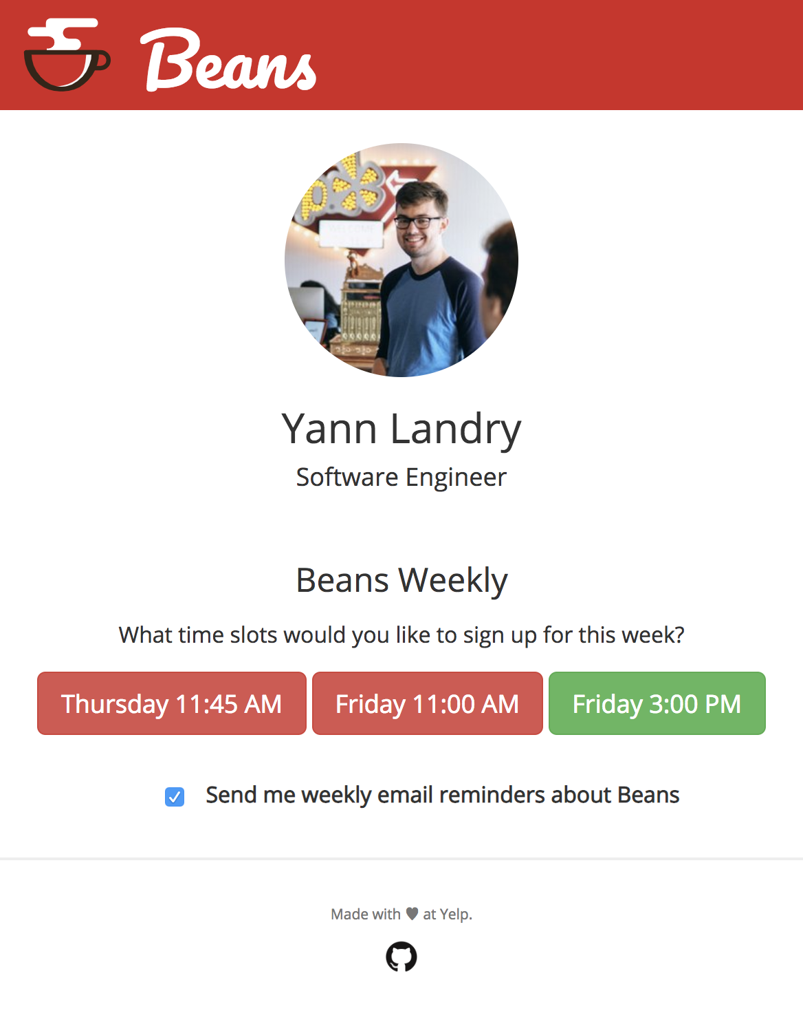
I think we could redesign the default or "home" page for Beans: In this example, this week I have signed up for the Beans meeting on Friday at 3 PM.
This gets rid of all preferences and forwards users directly to an interface where they can choose their preferred meeting time for the current week. There is only one checkbox to enable a weekly reminder email, but opting into and receiving that weekly reminder would not be required to jump into the matching process.
The pros of this refactor are:
No need to register a week before the first meeting;
No need to wait a week for a change in settings to take effect, because people choose their preferred time every week;
Anyone can register for a meeting at any time, so it's easy for newcomers to start meeting people immediately;
We don't need to maintain an entire preference system, and if new meeting slots open, people can join immediately;
We only need a system to send one reminder a week to users, so everyone gets at most one email, and those who choose not to don't receive anything while still being able to sign up;
This is already somewhat possible, but it's very easy to block/move slots every week due to holidays/events, and people can switch to a different meeting time as much as they want.
From the point of view of a user that receives a weekly email and signs up to a meeting time, the process requires the exact same amount of work: receive an email, click a link, then click a button to register to a meeting.
The text was updated successfully, but these errors were encountered:
I've just had a meeting with @kentwills about ideas to improve the Beans workflow and user experience, and I think we could make the entire workflow simpler for both the users and the maintainers.
Right now, it is required to sign up and set preferences at least a week ahead only to participate in the meetings. It also takes a full week until new preferences are applied. Personally, at work, I'm subscribed to all open slots so that I get to pick my meeting time every week.
I think we could redesign the default or "home" page for Beans:

In this example, this week I have signed up for the Beans meeting on Friday at 3 PM.
This gets rid of all preferences and forwards users directly to an interface where they can choose their preferred meeting time for the current week. There is only one checkbox to enable a weekly reminder email, but opting into and receiving that weekly reminder would not be required to jump into the matching process.
The pros of this refactor are:
From the point of view of a user that receives a weekly email and signs up to a meeting time, the process requires the exact same amount of work: receive an email, click a link, then click a button to register to a meeting.
The text was updated successfully, but these errors were encountered: