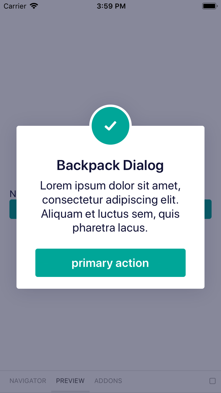
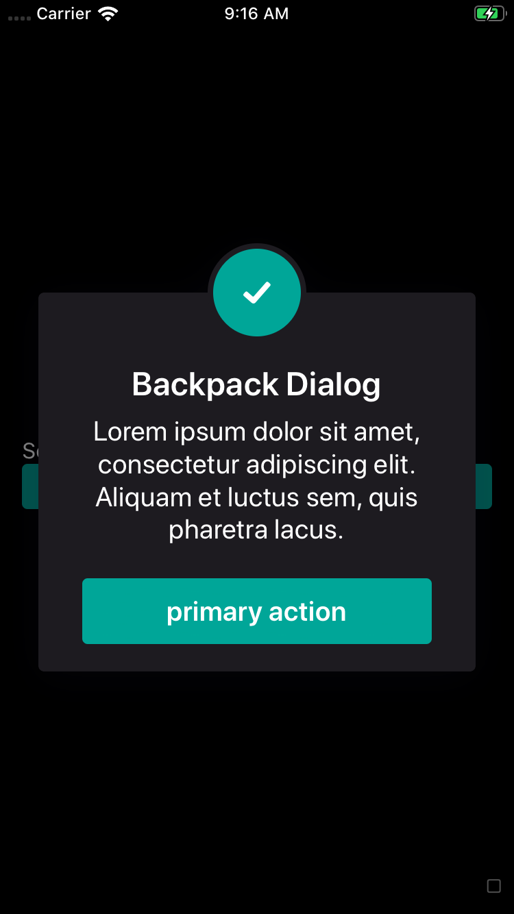
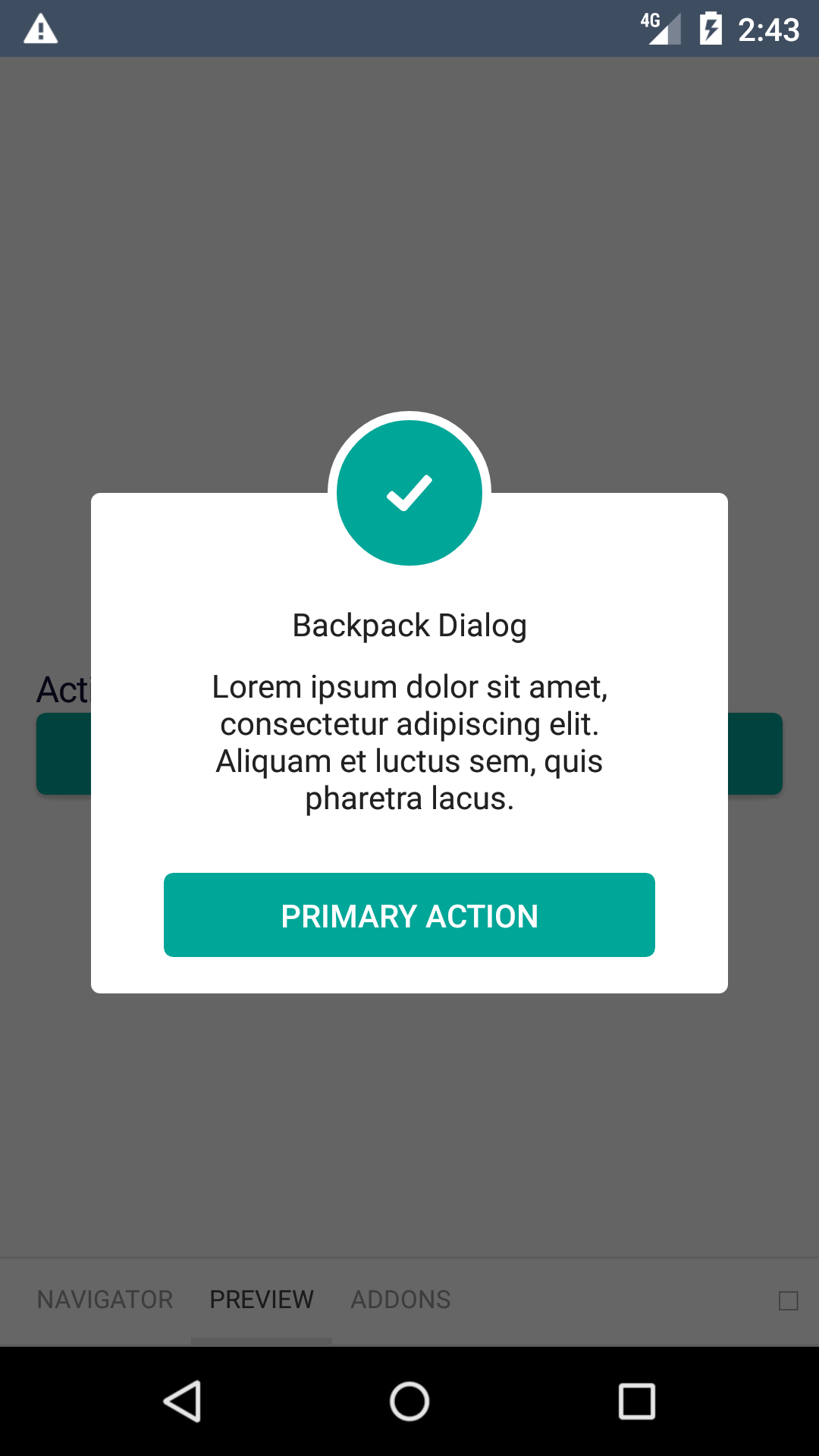
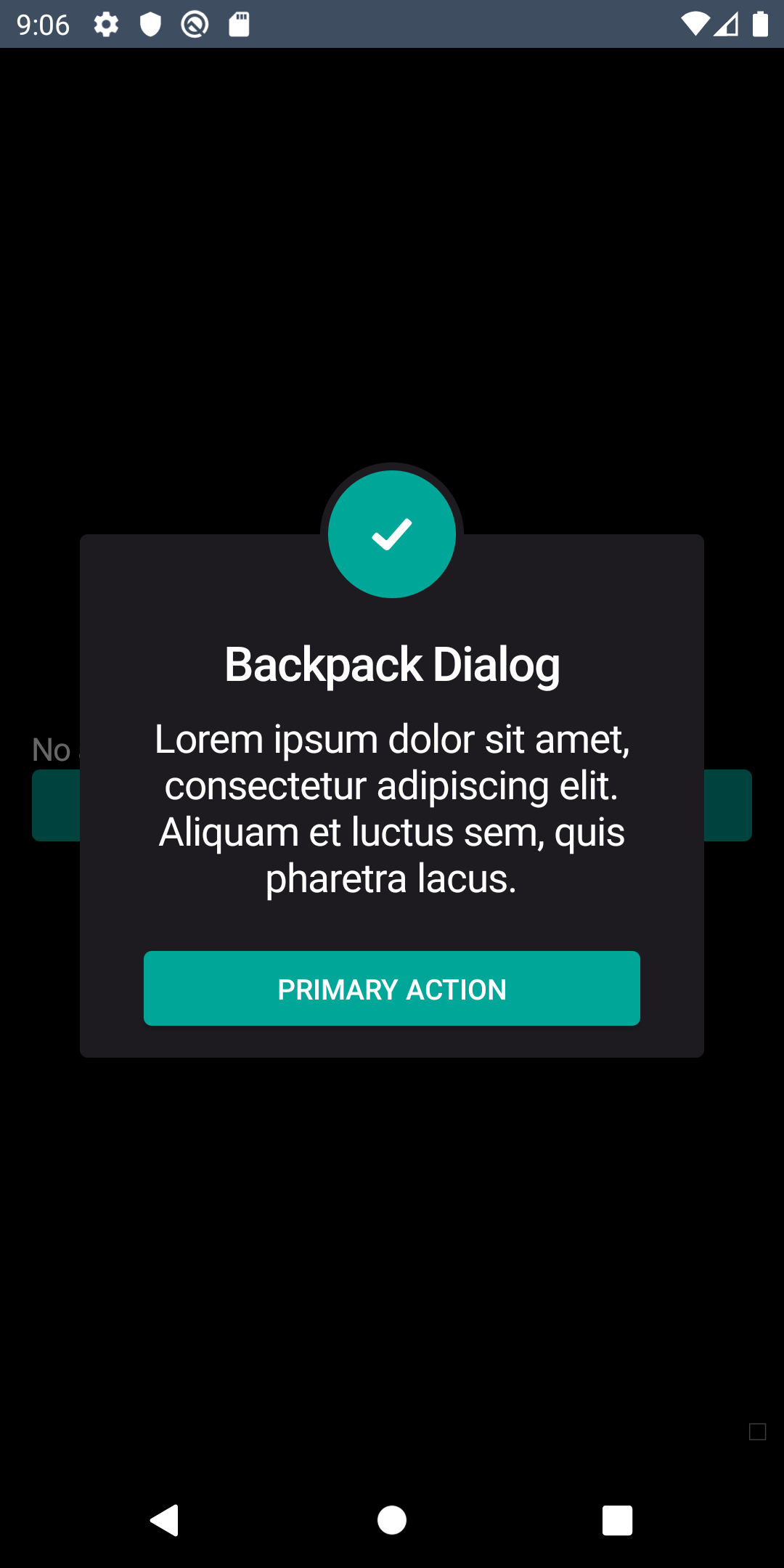
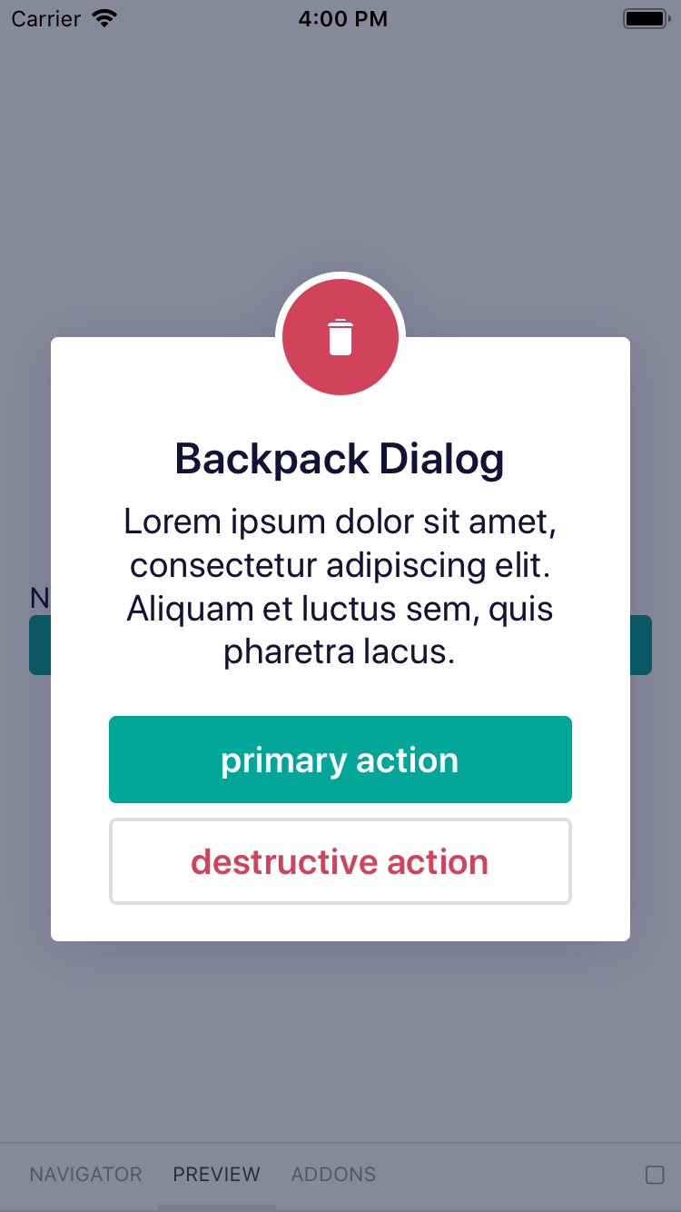
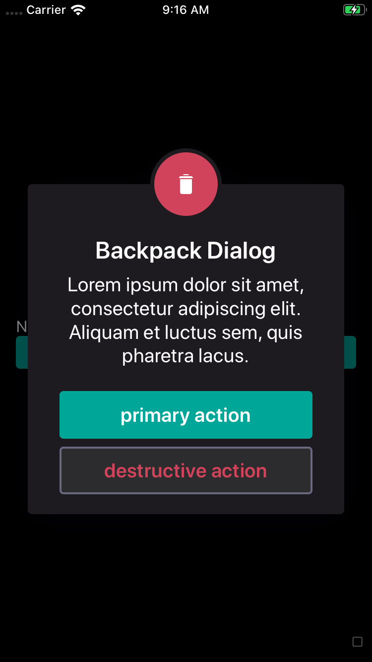
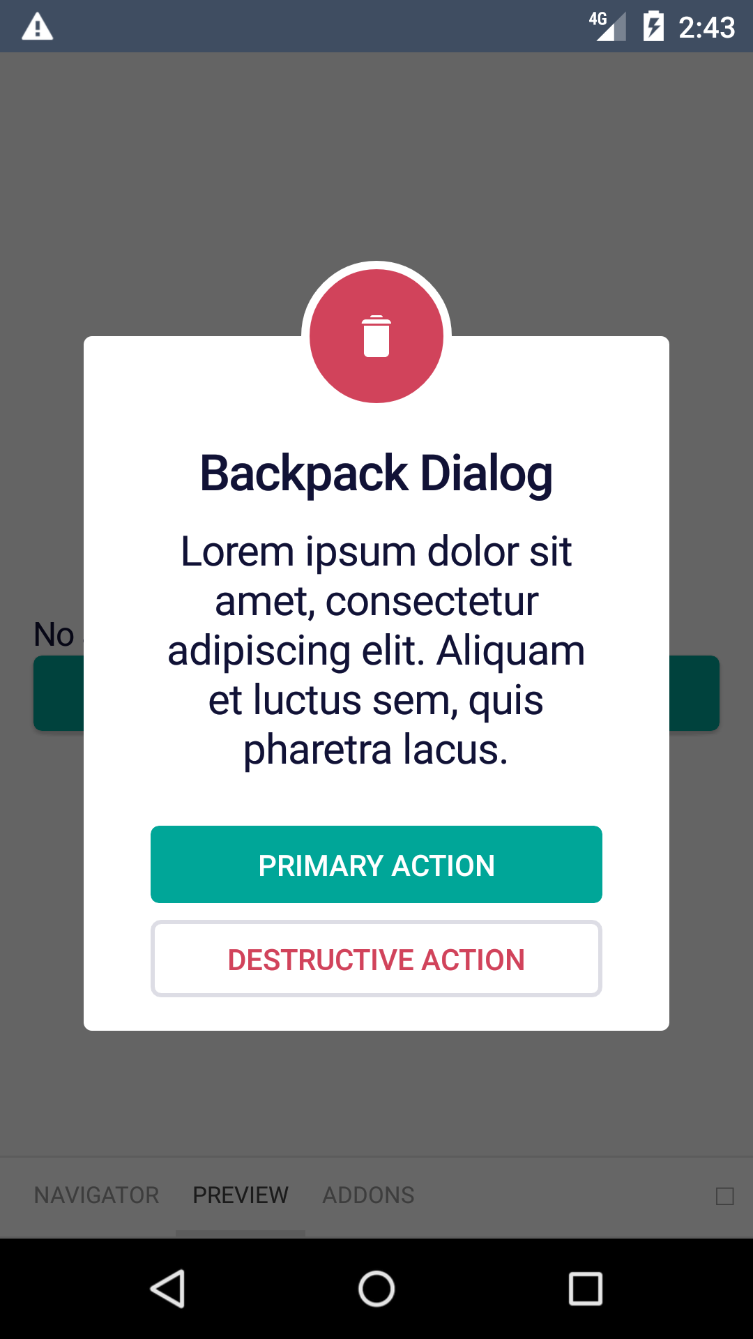
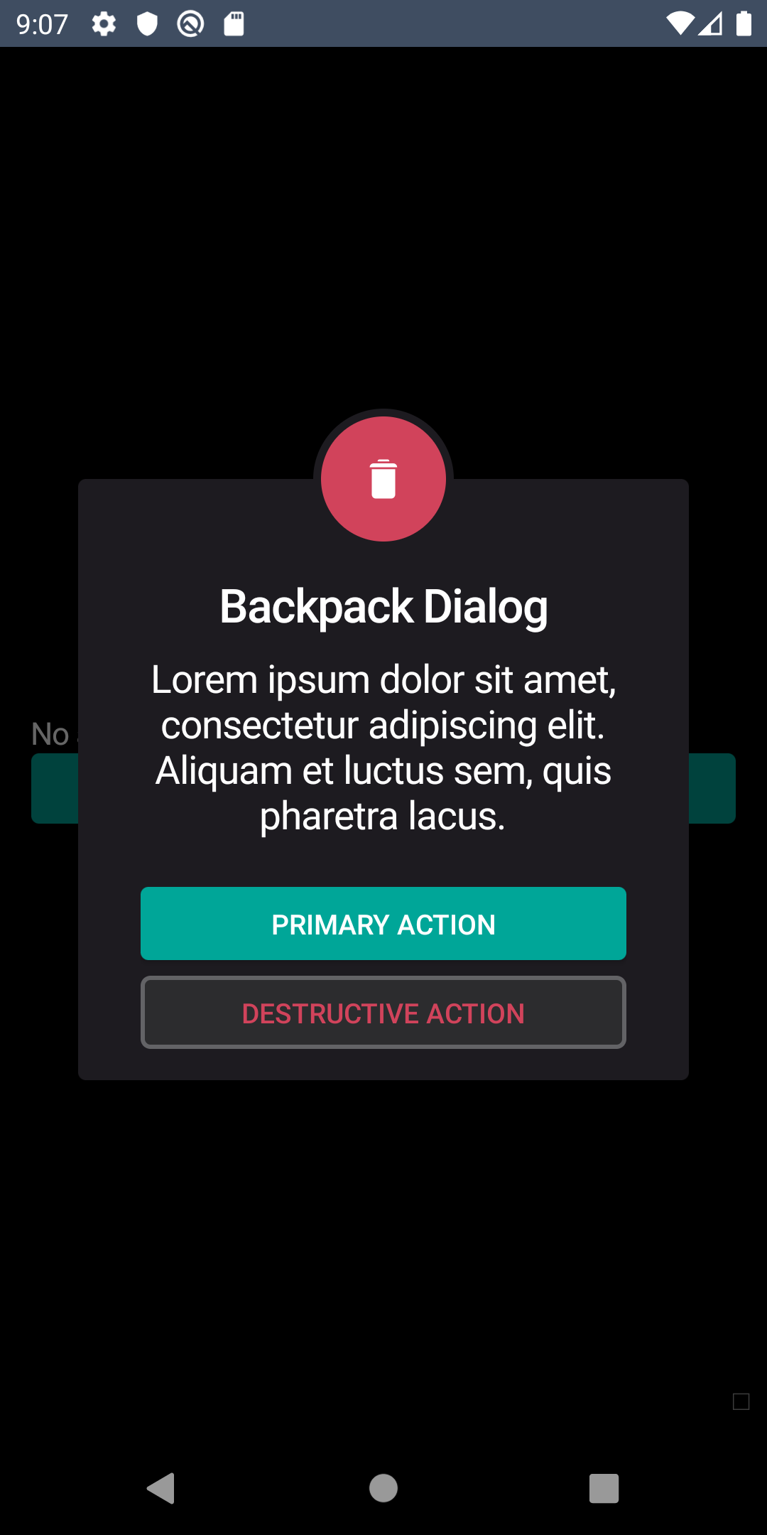
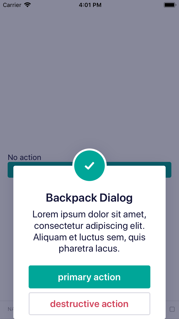
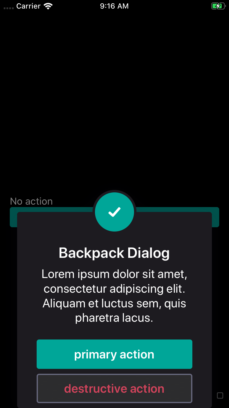
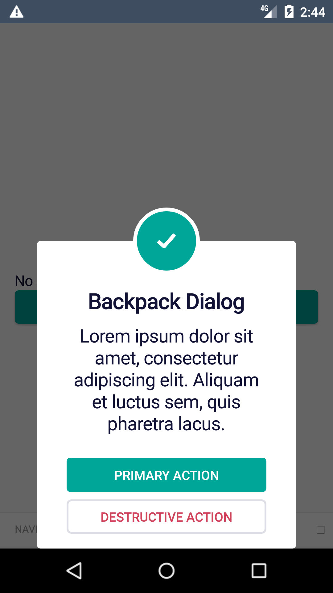
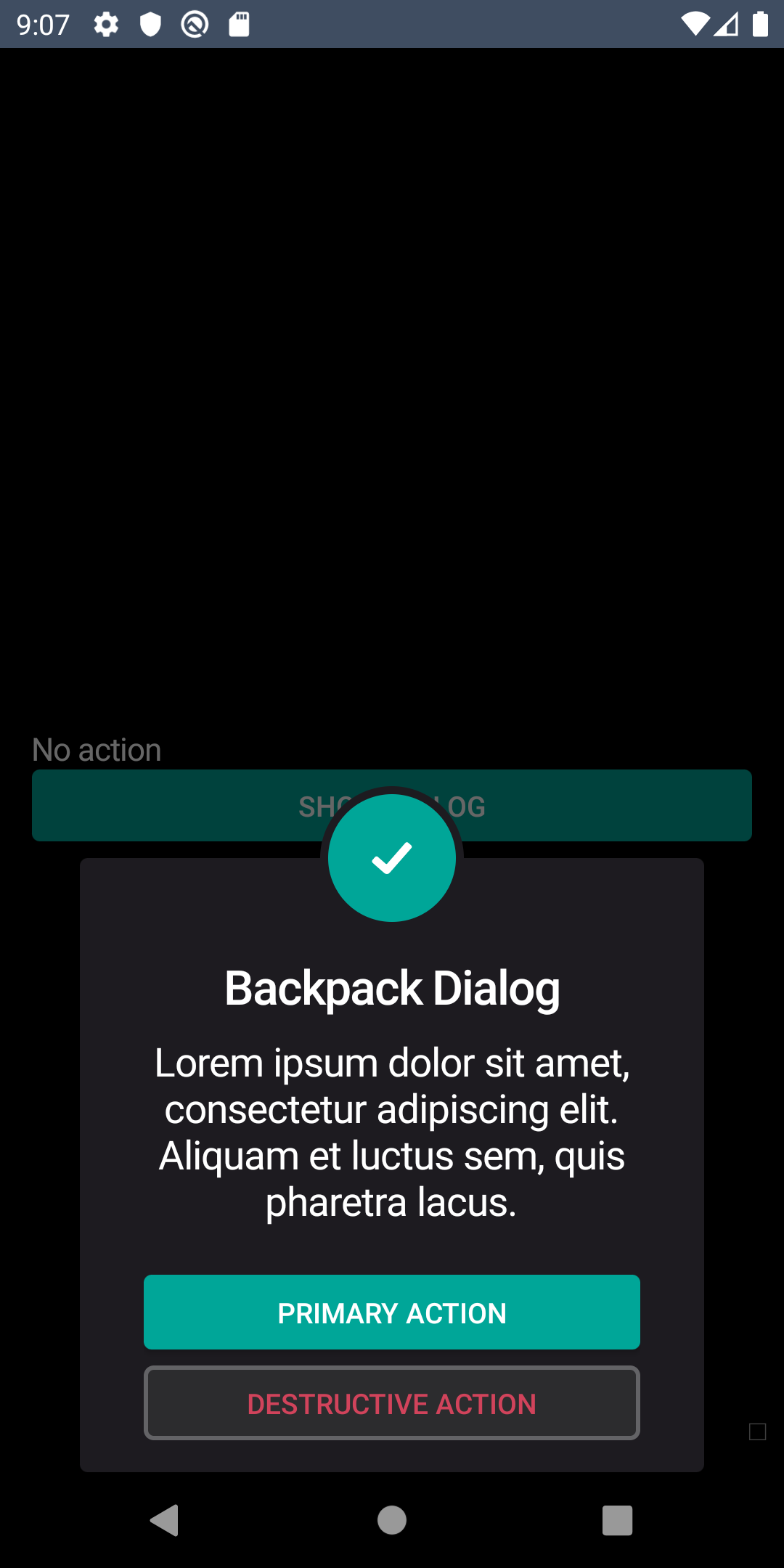
Backpack React Native dialog dialog.
Check the main Readme for a complete installation guide.
import React, { Component } from 'react';
import { View } from 'react-native';
import BpkButton from 'backpack-react-native/bpk-component-button';
import { icons } from 'backpack-react-native/bpk-component-icon';
import BpkDialog, { DIALOG_TYPE, BUTTON_TYPE } from 'backpack-react-native/bpk-component-dialog';

class App extends Component {
  constructor(props) {
    super(props);

    this.state = { isOpen: false };
  }

  openDialog = () => this.setState({ isOpen: true });

  handlePositiveAction = () => {
    // Do something
    this.setState({
      isOpen: false,
    });
  };

  handleNegativeAction = () => {
    // Do something else
    this.setState({
      isOpen: false,
    });
  };

  handleDismissAction = () => {
    // Do something else
    this.setState({
      isOpen: false,
    });
  };

  render() {
    return (
      <View>
        <BpkButton onPress={this.openDialog} title="Show dialog" />
        <BpkDialog
          dialogType={DIALOG_TYPE.alert}
          title={'Backpack Dialog'}
          description={'Lorem ipsum dolor sit amet, consectetur adipiscing elit...'}
          icon={{
            iconId: icons.tick,
            iconColor: 'monteverde'
          }}
          actions={[
            {
              text: 'Accept',
              type: BUTTON_TYPE.primary,
              callback: this.handlePositiveAction
            },
            {
              text: 'Decline',
              type: BUTTON_TYPE.destructive,
              callback: this.handleNegativeAction
            }
          ]}
          scrimAction={{
            enabled: true,
            callback: this.handleDismissAction
          }}
          isOpen={this.state.isOpen}
        />
      </View>
    );
  }
}
| Property |
PropType |
Required |
Default Value |
| dialogType |
DIALOG_TYPE |
true |
- |
| title |
string |
false |
- |
| description |
string |
false |
- |
| icon |
struct: { iconId: string, iconColor: string} |
true |
- |
| action |
array<action_type>* |
false |
- |
| scrimAction |
struct: { enabled: boolean, callback: func} |
false |
- |
| isOpen |
boolean |
true |
- |
* action_type has the following structure: { text: stirng, type: BUTTON_TYPE, callback: func }